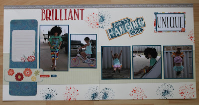
The Florence Collection is fabulous, the papers are beautiful, and the compliments kit contains 2 6x6 sticker sheets, assorted diecuts, sequins and the Copper Foil Tape.
I really enjoyed working with this collection, I really like how easy these two layouts came together, I used the Flip Flaps in the first layout and they are great, allowing you to add lots of photos to your page without making the page look cluttered.
This card folds flat for posting but can also stand for display, it's called a Z fold card it's a standard 4 1/4" x 5 1/2". You can find instructions here to make this card, my card opens from the bottom rather than the side. Adding the flower at the top of the card allows you to stand it up for display yet it folds flat for posting. I stamped the image on Colonial White cardstock and then a second time so I could colour the flowers with the Shin Han Markers. After colouring the flowers I used the new Shimmer Brush Z3293 , it add a lovely shine to the inked images. Then I fussy cut the flowers and added them the card adhering them with foam Tape.
To continue the hop go to Vandra's' blog and see what great project she has created.


I love that you've shown us 3 completely different ways to use this collection Doris.
ReplyDeleteThanks Shaunna.
DeleteLove the use of flip flaps on your first layout, and that card is stunning!
ReplyDeleteThanks Lauren, I love the flip flaps because I always take way too many photos.
DeleteGorgeous designs. I think I'll have to make a Z fold card!
ReplyDeleteThanks Georgia, the Z fold card is so easy to make
DeleteAll your work looks amazing. I love the splatter stamp page. the Florence accents look great.
ReplyDeleteThanks Vandra.
DeleteWow, fabulous ideas Doris. I just love your tip for using the flower to hold the front in place for display. Love the Z-Fold turned on its side too. Thank you so much for sharing! :)
ReplyDelete